Instagram feed is not going responsive on mobiles
Many people will browse your website from a mobile device, and in this case it is crucial to have your feed look just as good on mobile as it is on desktop. One image for all screen resolutions and different devices is definitely not enough. For this purpose, we have the Mobile Optimization setting that allows you to optimize the feed dimensions for various small display screens.
You can set the dimensions for as many different size devices as you need, there is no limit. You can set your feed’s responsive sizes on Layout tab, in Columns and Rows Section, Mobile Optimization field:
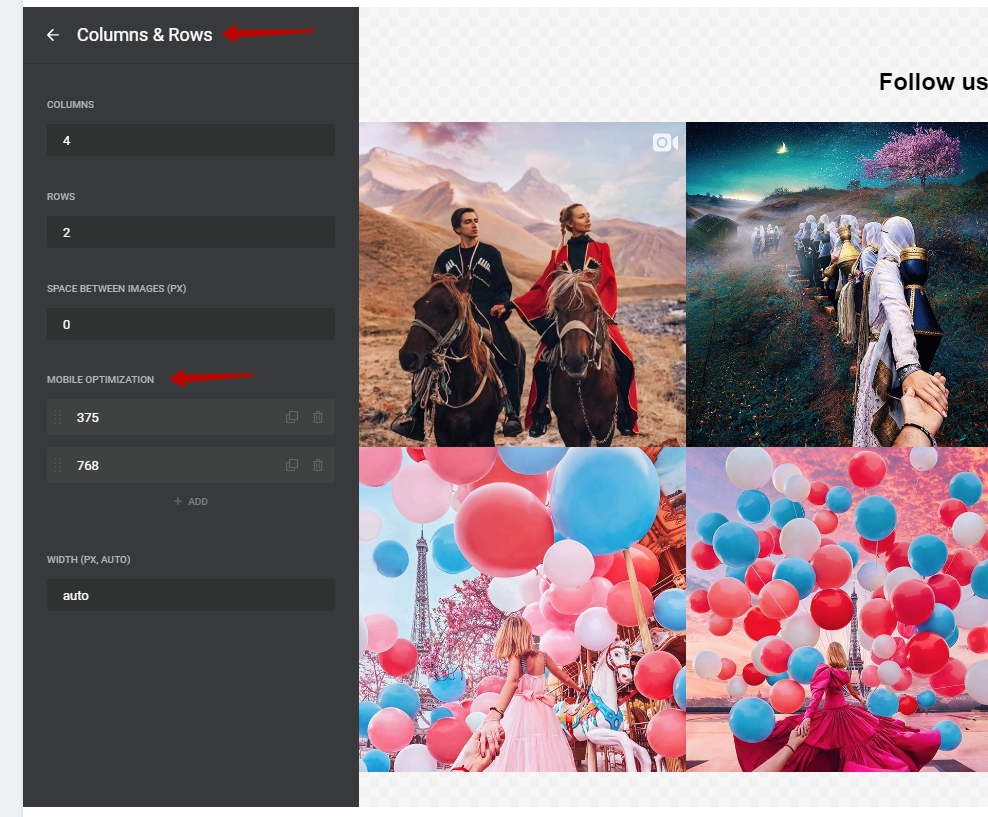
Press on a predefined mobile setting to edit it, or click on Add to set up your own one. You’ll get redirected to a screen where you can set the parameters of your mobile feed:
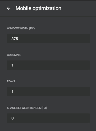
The responsive breakpoints option is very flexible, so you can set several breakpoints for any screen size, just don’t forget to save the changes you have made. However, here are our recommendations for optimum kinds of breakpoints:
- 1024 (for tablets with landscape orientation) for 3 or 4 columns at best;
- 768 (for tablets with portrait orientation) for you 2 or 3 columns at best;
- 480 (for mobile phones) for 1 or 2 columns at best.