YouTube gallery is not going responsive on mobile
To give your site’s guests a fantastic user experience even when browsing with a mobile device, you can use the mobile optimization option. It will change your gallery’s grid settings to make it look good on mobile and tablets by letting you set the gallery dimensions for screens of different sizes.
The good thing is that you can set not just one video grid for all the mobile devices, but as many as you need.
So how do you use this option?
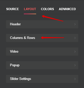
To set the mobile optimization, go to Layout tab, and select Columns&Rows section:
You’ll be redirected to a page where you can set the parameters of your video grid.
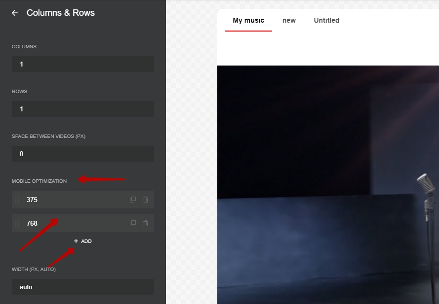
Click on a predefined mobile dimension to edit, or press Add to create a new set of mobile dimensions, and you’ll be redirected to this screen:
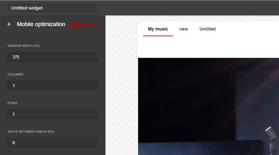
Set the window width in pixels, the number of rows and columns for your gallery, and the gutter value. You can set several breakpoints for different screen sizes. Don’t forget to save the changes after you’re done. You can use your own dimensions when setting the breakpoints, but these are the values that we recommend for different kinds of breakpoints:
- 1024 (for tablets with landscape orientation) for 3 or 4 columns at best;
- 768 (for tablets with portrait orientation) for 2 or 3 columns at best;
- 480 (for mobile phones) for 1 or 2 columns at best.